-
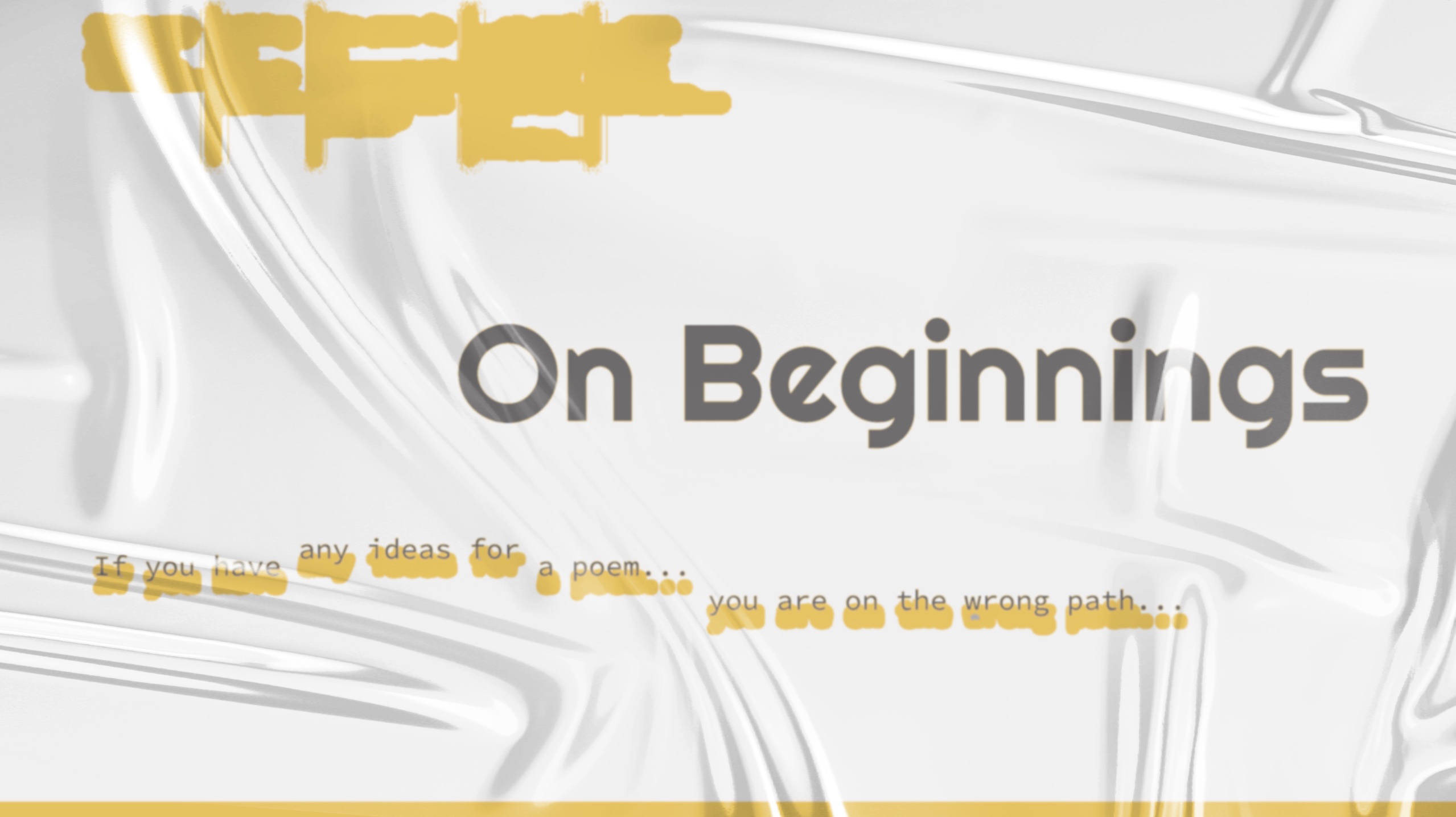
An experiment piece of how landing page works.
-
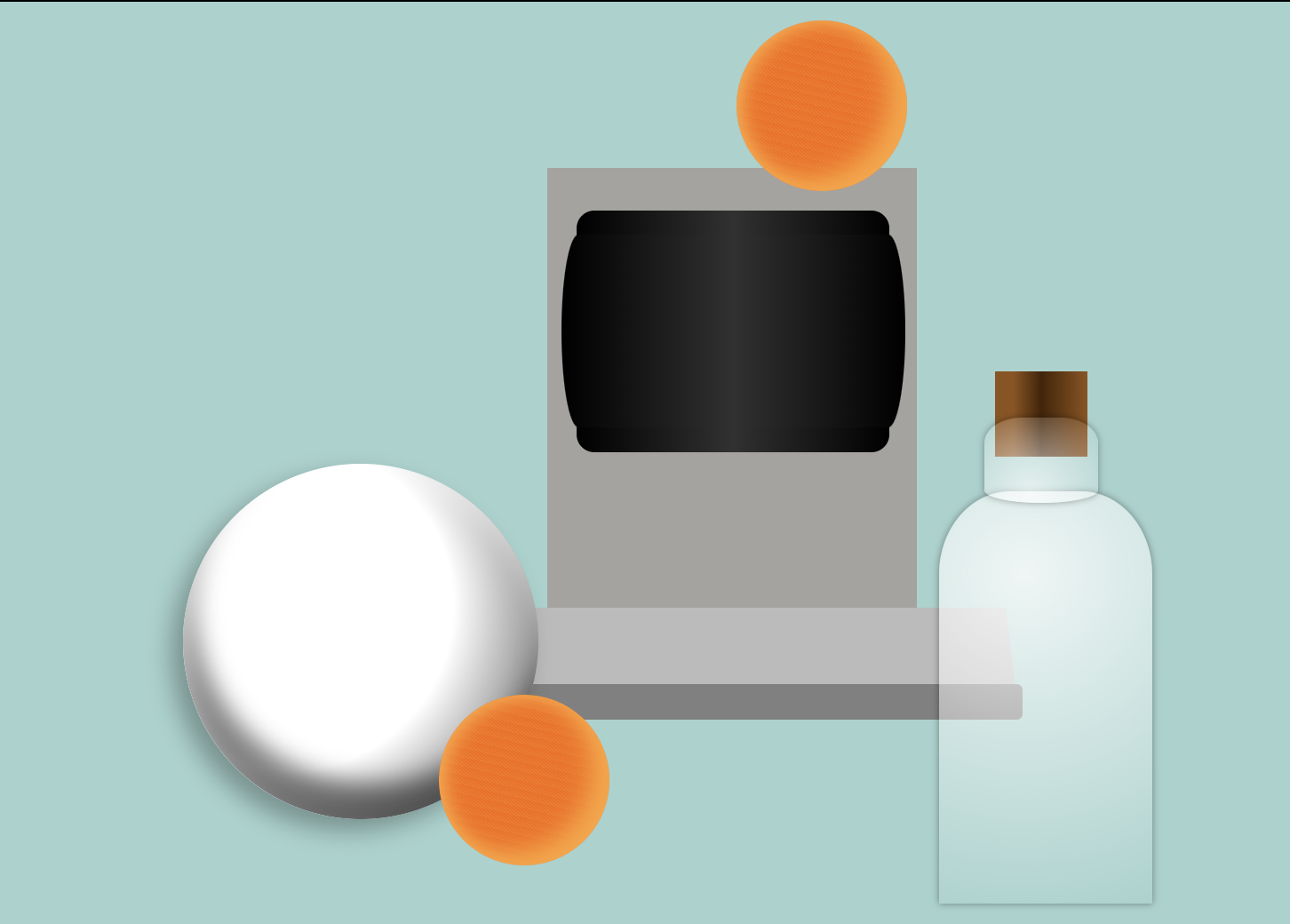
Create a still life composition using CSS positioning and advanced techniques like color gradients, patterns, border radius, and more.
-
This workshop shows how significant responsive-layout is and how to use media query to design a webpage for different screen size.
-
Alt-text is crucial, particularly when incorporating multiple images and videos into a document. Providing a description for each inserted image makes it easier for recognition and future adjustments.
-
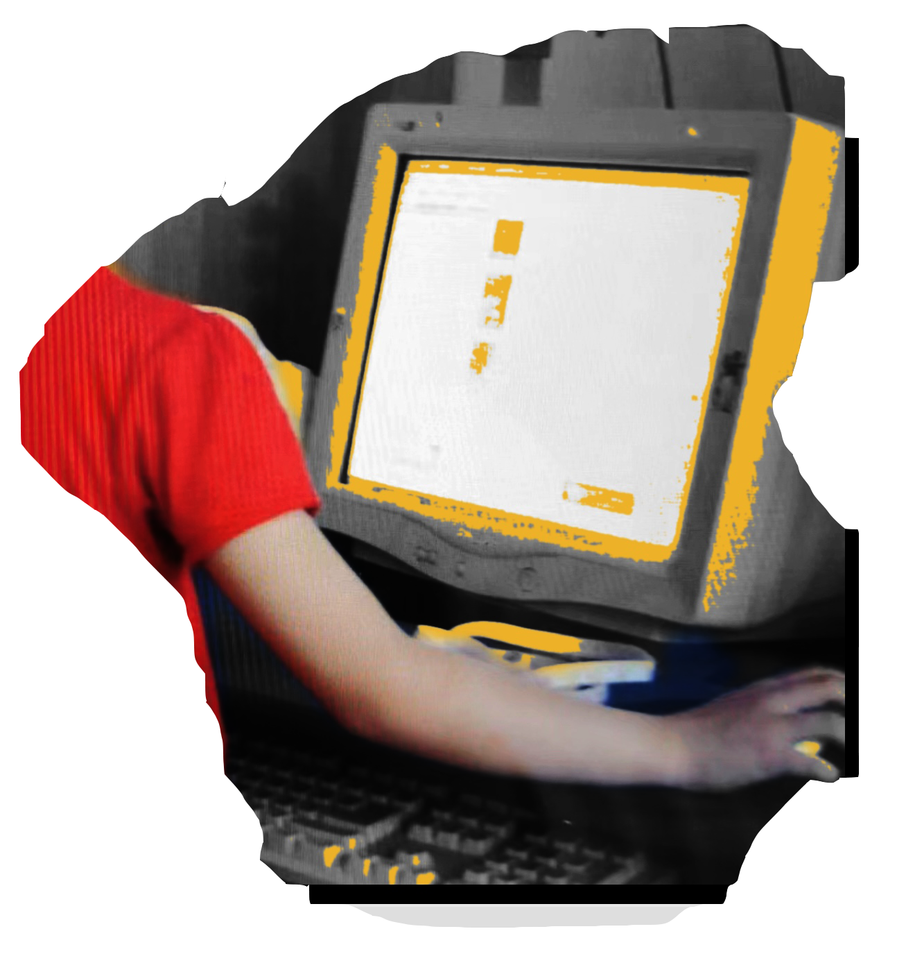
The workshop is a combination of writing, image, video, audio, and PDF document about my first chilhood experience with internet.
-
Exploring how grid and flexbox works.
-
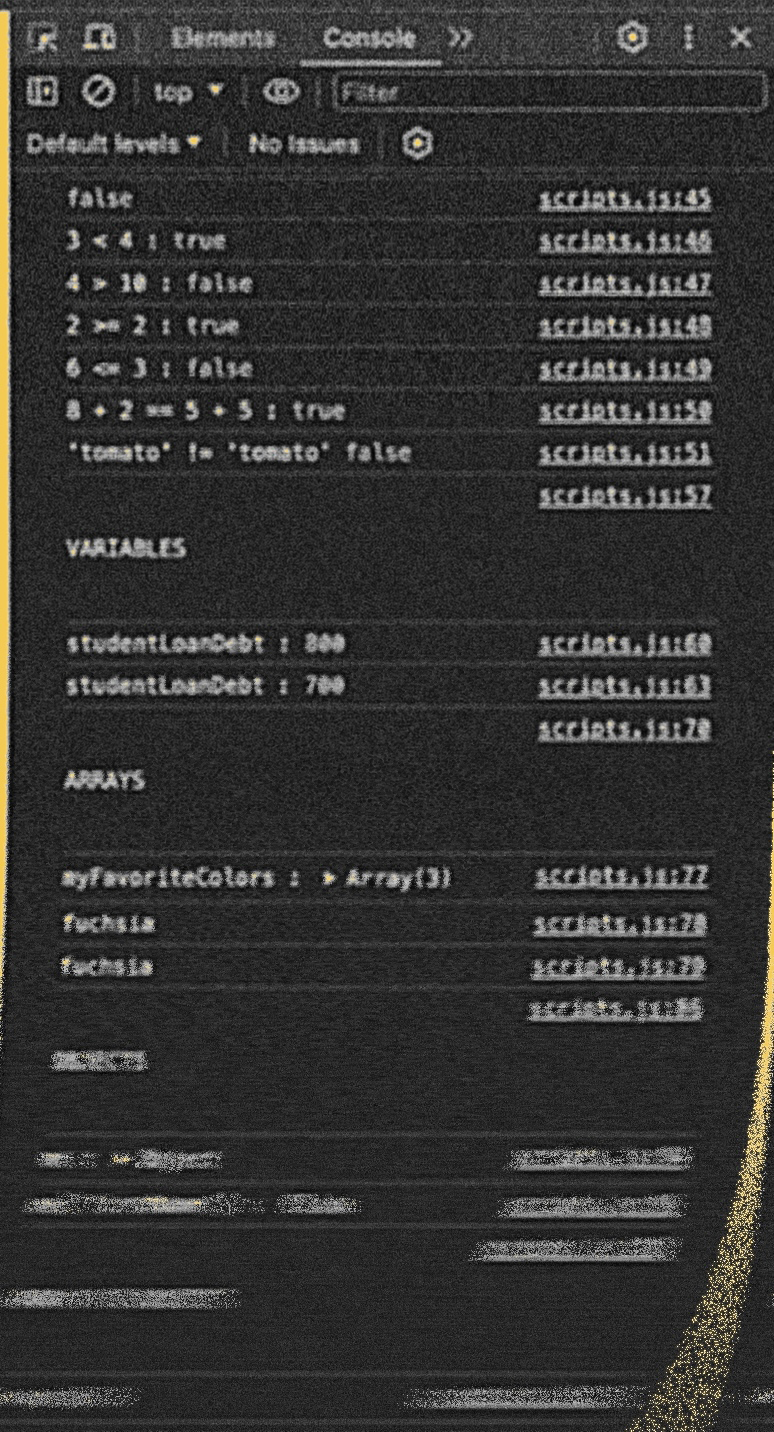
Some notes on how Javascript works.
-
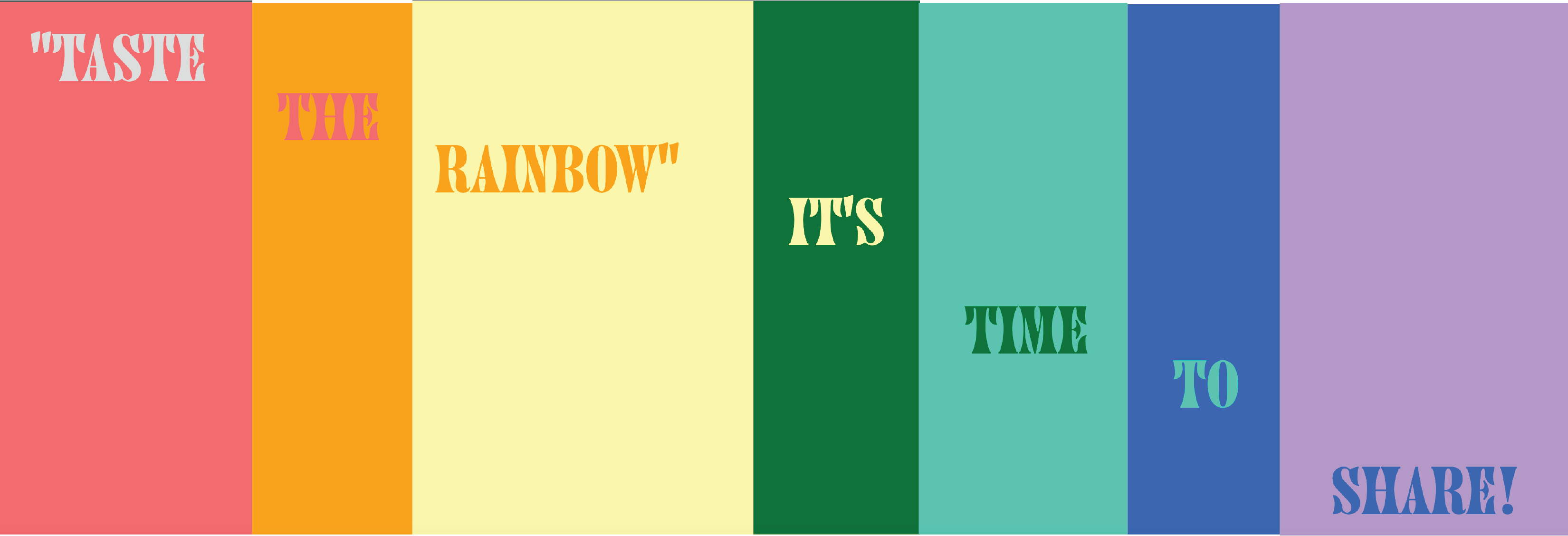
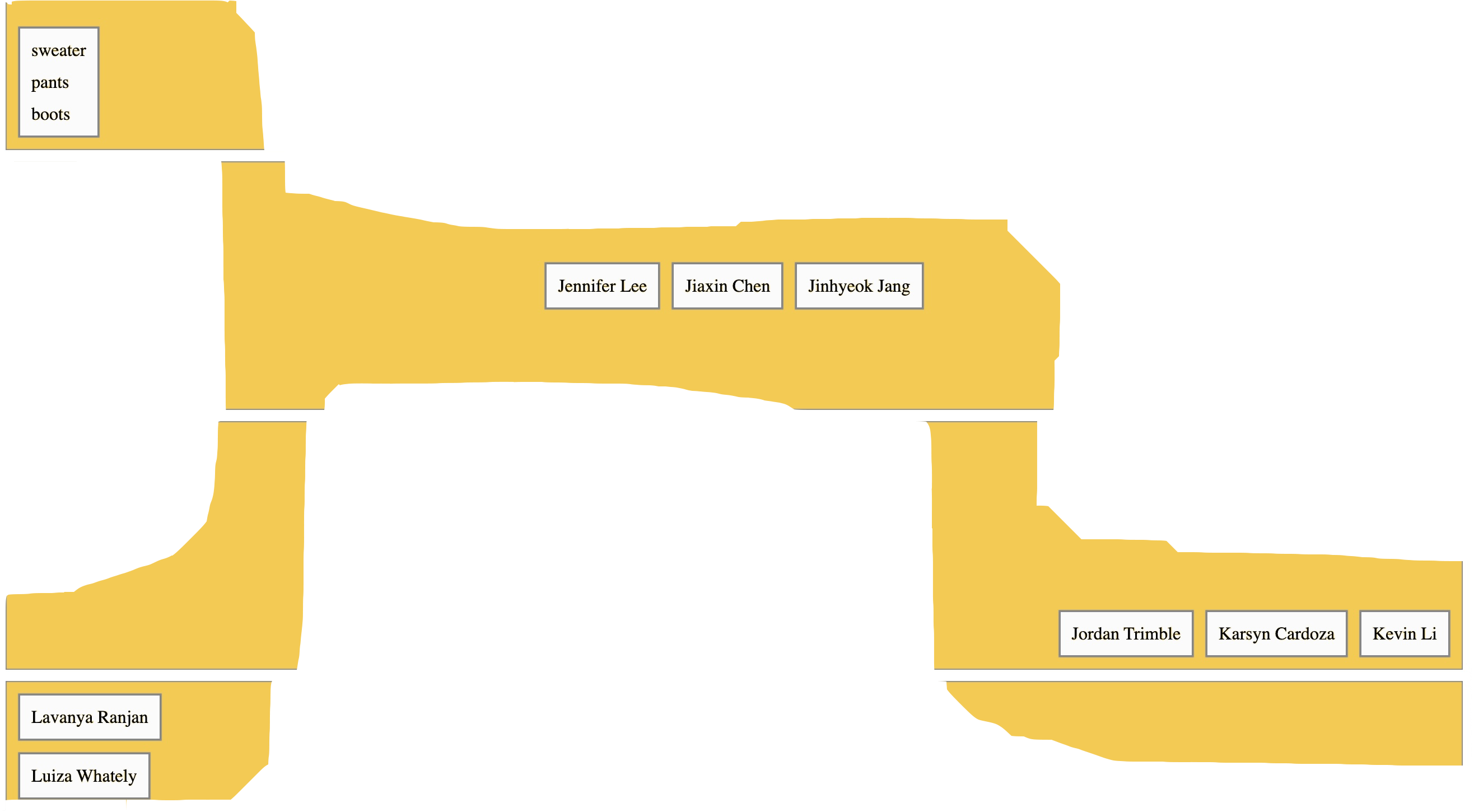
Putting subtitles, images, and descriptions into the same box and arrange the boxes in such a way that they automatically change line breaks as the screen size changes.
-
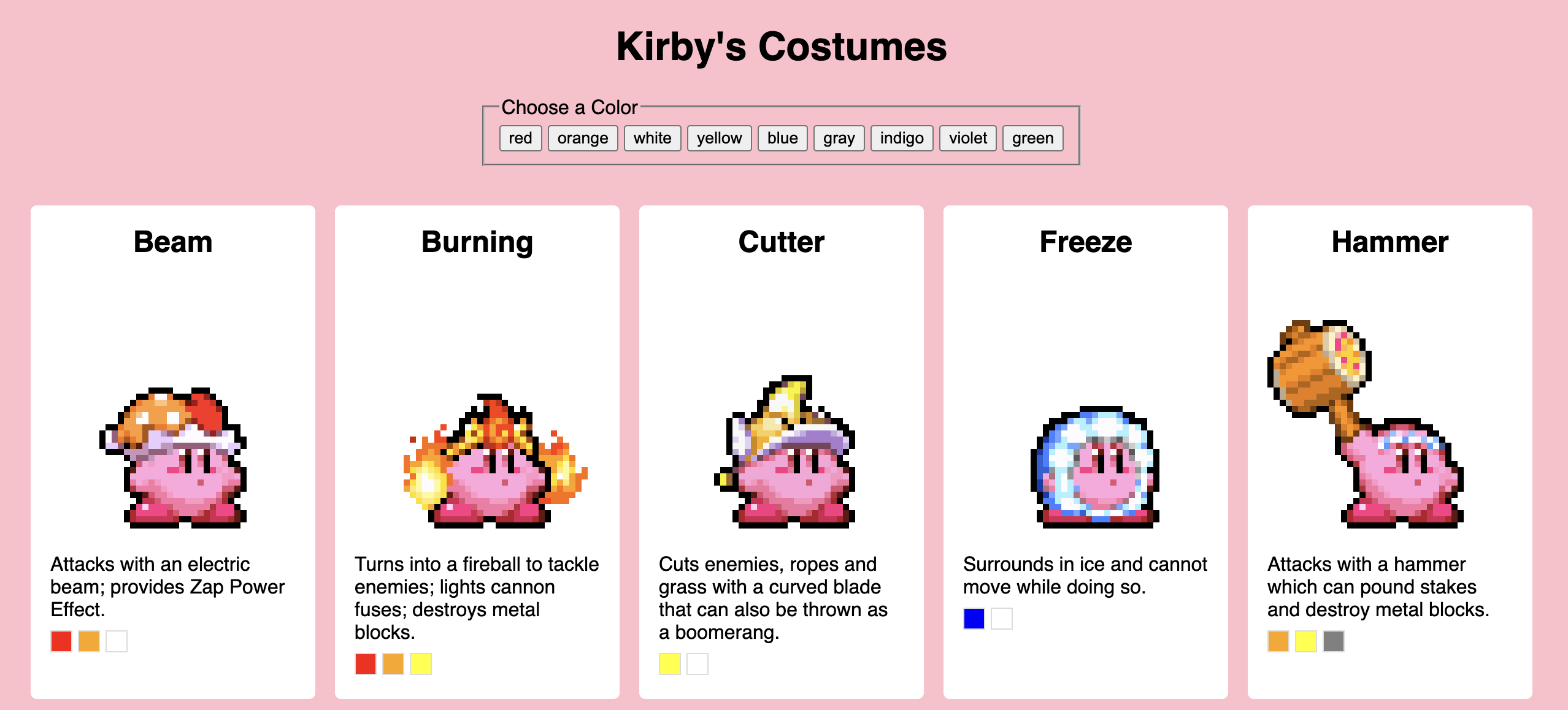
Adding a filter to the previous workshop for different color options.
-

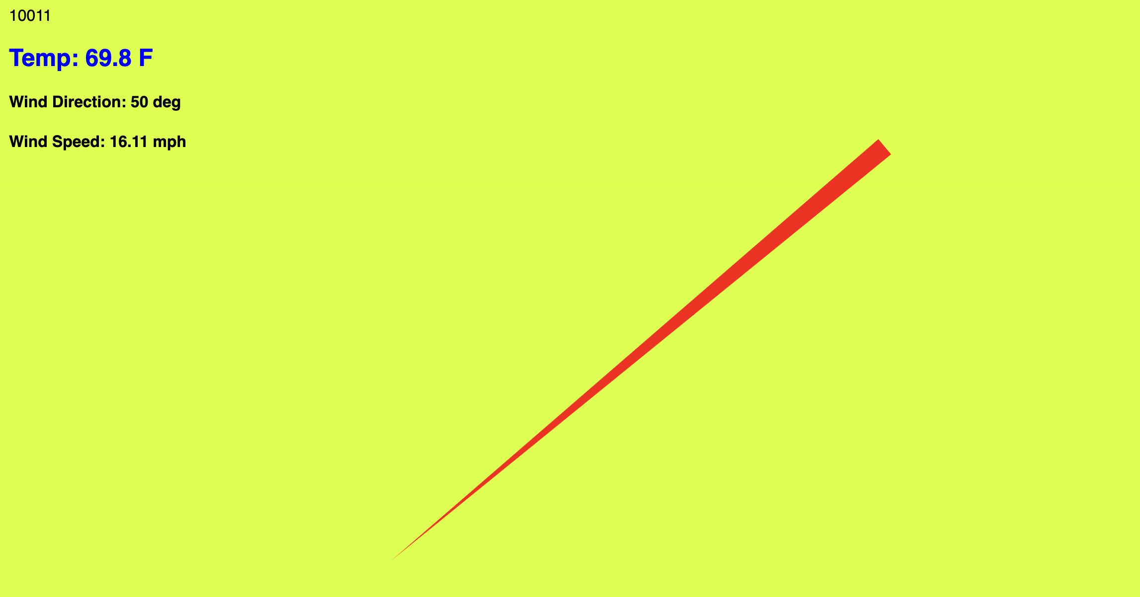
It was a class activity where each student was assigned an API, mostly related to time. Each of us designed a webpage with the API changing over time as an innerHTML element.
-